Back to the Beginning: Children’s Drawings

Rarely do I leaf through the voluminous stack of my children’s drawings. Yet when I do, I must be surprised to find that I “could draw better” back then.

At 3, 4, 5 years old – what vigour! What courage!

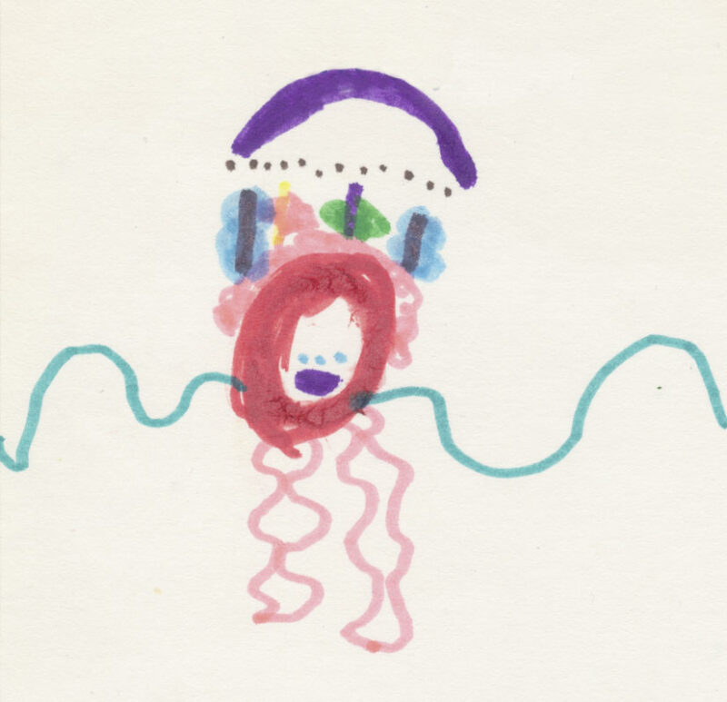
No fear of pink, stars, and hearts (which I still like).

No fear of perspective, for I knew none.

No respect for shadows, for I didn’t place any.

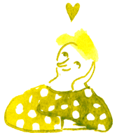
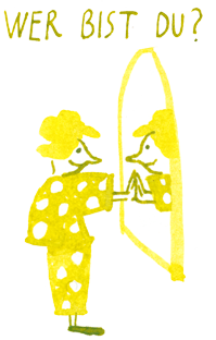
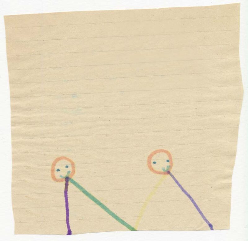
No attempt to give my characters recognisability – I decided who was who, period.

No idea what other contemporary artists outside the school corridor were capable of. I don’t believe it would have interested me particularly anyway.

What self-confidence is shown in these drawings.

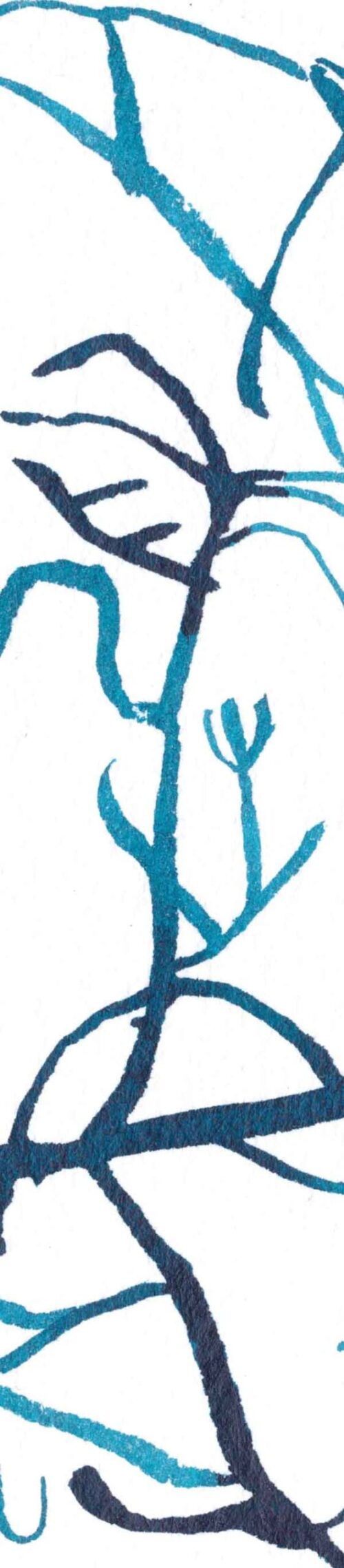
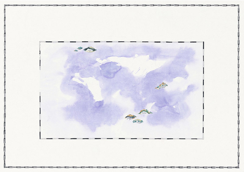
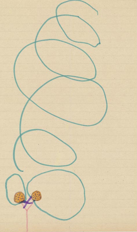
And what a sense of composition! Sometimes the paper is regularly filled with paint, sometimes a large white spot remains empty. Obviously intentionally. No fear of emptiness.

What a sense of rhythm and abstraction!

And what a contrast on one of the sheets, between the very small house and the large person beside it. Did I already know back then that people are more important than objects? Two decades later, I could name this principle of representation: perspective of significance.

What freedom and modesty in the choice of materials. Scrap paper was good enough.

How much focus and energy these drawings convey.

And how productive I was back then! Several finished drawings a day. Whereas now I need several weeks for one.

I threw away a third of my children’s drawings. Most of them had been good. I kept the “most beautiful” ones.

I found my evaluation of the drawings interesting. If I liked a drawing very much, but discovered on the back that it wasn’t mine, I could simply let it go. If my own name was behind it, I immediately felt a familiarity.

“I drew THIS!” is apparently a pride that is very flexibly applicable.

I threw away two-thirds of my drawings as a teenager. There was more pain in them; that’s where the insecurity began. Once an emotion has been expressed, I no longer need to keep it in the form of a drawing. Its purpose is fulfilled.

After that came art school, where I learned to channel this childlike energy without damaging it. We developed techniques to stay fresh and spontaneous before picking up the brush for the 10,000th time.

Then it was about showing perseverance. The child I was drew simply in freedom. If illustration is to be practised as a profession, constraints come into play.

These constraints are a blessing, for they invite me to open up and explore new visual places.

Nevertheless, evaluation criteria remain important:

– “Do I enjoy drawing?”

If the joy has completely disappeared, something has gone wrong.

– “Does a certain lightness reach the viewers?”

If it is missing, I may reflect on at which point in the process I lost it myself, so that its absence is palpable.

Paper, Pen, Brush, and Paint

The paint. Liquid. The pen has absorbed a lot of it. Apparently too much. I write a word, beautiful and even, and on the last letter – Splash! My word is swimming in the puddle.

The paper.

The stroke was perfect. For a second. Then the ground behaves like blotting paper. It was more open than I thought. The line is no longer clean.

The pen.

I want to make round letters from round arm movements. I breathe in and start. The pen resists my momentum. It stops on the paper far too early, and I cannot finish my letter.

The brush.

A hair has come loose from the brush. Now it lies in the middle of the painted area. If I try to remove it with my finger, I destroy the calm of the even application of paint, which will soon be completely dry.

The paper.

I was immersed in drawing. For an angled brushstroke, I rested my elbow on the work surface. And there it happened: The paper got an incurable crease at the edge.

The paint again.

Fully engaged, I continued drawing. Meanwhile, I didn’t notice that my hand was brushing over the lines I had just drawn. The paint landed where it didn’t belong.

Pen, brush, paper, paint… so innocent.

For Whom Do I Draw?

My client likes the drawing, and I don’t. I like the drawing, and my client doesn’t. I can now avoid one of these two situations.

I only show drawings that I can stand behind.

No one should fall in love with an illustration for which I would be ashamed.

Even though I appreciate “shame competence” very much.

And if my client doesn’t like the drawing, then it is due to something.

Usually, I even understand it. I accept the challenge.

It is already nice and should become even nicer. Or rather, it is simply a matter of taste.

Perhaps I don’t see the colours correctly myself, who knows? In my world, everything is beautiful, and… What do other eyes see?

Like or Dislike, what does that say about the value of a mature drawing?

And for whom do I draw? For me or for you?

Completion of a Drawing

The day is finished, but the drawing is not. How am I supposed to sleep tonight if the result on paper only resembles a mere disappointment?

Every hour I spend on it makes the drawing worse.

I can’t go on. I need a break.

But for a break, I need at least an intermediate result.

I mean, a successful one.

One that gives me the courage not to give up drawing completely.

Only, the energy isn’t enough.

And this intermediate result, I’ve been waiting for it for hours.

OK. When did I still like the drawing?

Yesterday. The pencil draft? Yes.

So we discard all the colour combinations I tried today? Yes.

What a waste of time, energy, paper, and paint! – Yes, perhaps.

Now I’ll give up drawing forever.

“I will never draw again!”

Apparently, I can’t anyway.

That means consistency.

What a relief!

Never draw again, just imagine!

Now it applies forever.

I mean: Just now, you know?

That is also relieving.

From Head to Paper

The character wants to live. While it still exists only in my head, it sets my hands in motion. Driven, I fetch paper, brush, pen, and all the inks.

Comic drawing. The little woman looks up into the air with a dreamy smile. She rests her head on one hand. A small heart is drawn above her head.
Ink illustration in the style of a comic drawing. The little woman in a polka-dot outfit holds a chicken in her hands. Drawn with pen and brush.
Comic drawing. The ink illustration shows the little woman with a polka dot outfit doing a handstand. She smiles.
Ink illustration for the category "Body Sketches". The little woman in a polka-dot outfit stands in front of a mirror. She places a hand on its surface and looks at her reflection. She asks, "Who are you?". The fine drawing is done with brush and pen.

– “Yes, yes, wait. Soon. Now we can start. What colour do you want, first of all?”

The character moves my hands quickly, and soon I have collected and sorted many small ink pots in front of me.

– “Yellow? Green? Gold-green? Yellow-green? Chick yellow? Tooth yellow? Formica yellow? Hmm… OK, that’s not quite my colour!”

– “But it is mine!”

I draw. The character, who still exists only in my head, is not satisfied at all.

– “I don’t look like that!”

– “I know that already.”

I draw.

– “Not like that!”

– “I knooooow. I’m just getting warmed up.”

– “So, what do you think of this?”

– “Not bad, but not good.”

– “That matches my feeling too. Tell me, what is your nose like? Pointed, round? Small, big?”

– “What my nose looks like is your job. Anyway, I am sweet, smart, playful, and simply happy all round.”

– “You are lucky.”

Then the big moment arrives. Silence in the head. I look at the picture. And I no longer know where the character is. In my head or on the paper?

– “Hey. Are you there?”

Silence. The character on the paper looks at me. It looks sweet, but not statuesque, smart, but not gifted, playful and happy anyway.

And green, very green it looks. I wonder how this gold-green – which on its worst days is simply just khaki and on its best days has a warm orange tint – will look on my website. But well… That wasn’t my decision.

It looks as if this character knows no worries. Inspiring.

– “I don’t know any either! That’s the idea, that I’m not like you!”

– “I agree with you. Oh and! Are you speaking again?”

Now I draw and draw. There will be many. Suddenly I no longer know where the real, the original, the true character stands.

– “Is that you?”

– “No.”

– “And this one?”

– “No.”

– “Where are you, my goodness!?”

– “That one has my nose, that one has my hands. Take my eyes here.”

The next day, in all freshness, crafting begins.

Then it happens again. Silence in the head. I think we are celebrating a birthday today.

– “Now we need a name for you. And what are you anyway? Woman, man? Child? All? Are you very young, very old? Both?”

But the character no longer speaks. It exists now only on the paper. And I can rest.

Life with this character has settled down. It is no longer so exciting, but still beautiful. Sometimes I think the character is not elegant enough. It seems a bit rough. It sometimes even looks silly. But wait. Am I a mother who loves unconditionally, or not?

A Very Personal Gift – Life Map


Resources, the power of relationships, and sources of meaning. The psychologist Mihaly Csíkszentmihályi researched psychic energy for decades. His conclusion: when this energy is channelled towards a self-chosen goal, states of happiness arise which he called “Flow”. Having clarity on which activities have the greatest chance of triggering these states gives us the opportunity to consciously integrate them into our daily lives.

Step 1 – The Intention. The process is intended to express gratitude for the journey travelled so far and to serve as a reminder of meaningful activities. Life-changing experiences, resources, and sources of meaning and strength also have their place in a Life Map.

Step 2 – Coaching in Positive Psychology. In three longer sessions, the content is worked out. I receive a detailed brief with the elements to be drawn.

Step 3 – The Aesthetic Project.
The client likes the “pen aesthetic” with a sepia background, similar to old maps. She wants to create a certain lightness through fine lines. Her desired colour palette consists of earthy tones and natural colours.

Step 4 – The Templates. I receive plenty of templates: photos for the motifs and inspirations for the style.

Step 5 – The Pencil Draft with Handwritten Text. I develop my proposal for the composition. The pencil motifs are to serve later as templates for the pen strokes. The texts come from the client’s brief; now I ensure they appear balanced in the layout. The legend in flowing handwriting is inspired by old geographical maps.

Step 6 – First Feedback Loop. I implement the changes the client wishes for the motif details. One eraser stroke and suddenly the face, body posture, or object looks different. We now get a first impression of the final result.


Step 7 – Starting the Final Drawing. I like to place the frame first. This is the setting in which everything takes place. The borders of the map are meticulously hand-drawn, with maximum focus on regular, recurring geometric shapes.

Ink drawing. Here, only two frames are visible (a large one and a small one), drawn with a pen. In the middle are areas of watercolour-like paint, suggesting seas. Five islands are distributed and drawn in ink in the final version.

Step 8 – The Final Drawing. Now it really begins! With joyful concentration, I draw continents, animals, boats, and coats of arms in the centre of the map – with a pen and coloured ink. For lines and texts, I use black or sepia ink. I approach this stage with respect. This is where the final forms and lines emerge. The overall impression should be delicate, strong, round, or straight at the appropriate places.

Step 9 – Second Feedback Loop. The client can now note further details she would like differently. I implement them. And… are we finished? It looks like we are!

Step 10 – Reflection. The drawing appears surprisingly light. I accept the sometimes cheeky process, which constantly offered me new surprises to solve. On a content and aesthetic level, countless small decisions were made, often after much trial and error and reflection. We do not see this here – what a relief!

Step 11 – Fine Art Print. I send the file to the Fine Art printer. On-site, fine adjustments are made so that black and colours are printed as desired.

Step 12 – Framing. The decision falls on fine black mouldings and anti-reflective museum glass with UV protection. The passe-partout colour is chosen according to the “six-eyes principle”…

Illustration for a Magazine

“Taking in refugees.” Rarely do the first sketches of a project remain intact until the drawing has reached its final form. Typically, an illustration undergoes a multitude of small steps that do not necessarily move things forward… The process goes back and forth, and eventually, clarity arrives: “Finished!”. The German Transform magazine aims to dedicate itself to “impulses for societal change towards a good life for all”.

Step 1 – The Intention. How to approach the reactions to the “refugee wave” of 2015 in Germany with both humour and depth?

Step 2 – The Idea. A well-meaning and affluent person with plenty of compassion but little drive to act.

Step 3 – The Text. Realistically inventing and writing down the thoughts of the main character. Several drafts until the words sit right.

Step 4 – The Stage Decor. A living room in the style of an interior design magazine serves as my template. I draw it.

Black and white sketch on a white background. The ink drawing, created with a brush, shows a living room in the style of an interior design magazine.

Step 5 – Character, Decor, and Texts Combined. The thoughts start top-left and develop organically towards the bottom-right in the reading direction, leading to the woman who is thinking them. The handwritten text was too restless.

Drawing with coloured pencil: a woman sits on the sofa in a living room in the style of an interior design magazine. Text in handwriting.

Step 6 – Making the Text Readable for Print. I decide to use a computer font that allows the text to recede into the background, while the living room takes up more space.

Step 7 – Drawing Technique. Decision made: it will be an ink and brush drawing. Back to the style of the original decor sketch.

Step 8 – The Character. It needs to stand out. The simple contrast between two primary colours immediately draws the eye to the main figure.

Step 9 – The Title. So that the title of the illustration fits well into the drawing, it is written by hand – with a coloured pencil.

This blue ink drawing is the finished commissioned artwork. It shows a living room in the style of an interior design magazine where a seated woman, in a red dress, reflects on why she cannot welcome displaced people into her home.

Review – In retrospect, I would have preferred to choose a man as the main character, as statistically, the majority of women worldwide perform “care work”. But humour stops for no one…

Vinyl Artwork & CD Cover

Third Album – The Jazz-Swingband Paris Gadjo Club. This vinyl artwork and CD cover is the design of the last album of the triptych “Café du Brésil” by the jazz band Paris Gadjo Club. The band founder, Christophe, needed a third music album for his of new compositions. He said to me: “This time, it really has to be night.” The prominent guest, Yamandu Costa, was to fit into the group and his contribution deserved to be honoured.

Step 1 – The Intention. Design for the last CD of the “Café du Brésil” series. After the first two CD covers with a light background, a night situation was appropriate. Musicians, singer, and audience have reached the final act of the day: the deep night. The mood has something magical: the music enchants everyone present – it is late, but no one wants to leave.

Step 2 – The Motif. The drawing should have something of an open-air concert on a mild summer night. The street should be recognisable as such, with city trees and a lamppost. The focus should be on the band playing for an attentive audience.

Step 3 – The Focus: The Music Band. On this album, there is a guest musician: the virtuoso Brazilian guitarist Yamandu Costa. A wonderful trumpeter and a sensitive accordionist expand the original lineup. All should be shown in full flow. The note “Special Guest Yamandu Costa” should be placed somewhere visible.

Step 4 – The Templates. I receive many templates from Christophe: photos of the band members and night shots of bars, cafes, and restaurants with string lights. This gives me an impression of the atmosphere he likes and he would like to incorporate into the drawing.

Step 5 – The Overall Composition in Pencil Draft. How do we occupy the format? Christophe wants to take the cafe as the setting again. I suggest showing very little of the cafe itself – unlike the previous two music albums – and instead creating a stage situation. For the spatial representation, the Parisian street at night is in the background. In the middle ground stands the music band, and in the foreground, we see the audience with the band’s name and the album title.

Pencil on paper. Sketch of an open-air concert scene in front of "Café du Brésil III". A lamppost and street trees frame the stage. On stage, a singer is accompanied by seven musicians. In front stands an attentive audience. Under the scene, the handwritten text reads "Swinging Brasil, Paris Gadjo Club". On the right of the image stands "Special guest Yamandu Costa".

Step 6 – The Composition of the Band. How should the musicians and the singer stand in relation to each other? In which direction are their bodies inclined? Who is standing, who is sitting? Christophe would like the lineup to be placed as it is during the concerts. I note the order and postures: the singer, the trumpeter, the double bassist, and the accordionist are standing. The guitarists are sitting.

Step 7 – Green Light from Christophe. I start with the final drawing. The final illustration emerges through numerous small decisions. I list a few below.

Step 8 – The Colour Selection. The background is kept rather cold, with indigo and very pale turquoise. The tree backdrop on the right and left in dark old Bordeaux highlights the night atmosphere, as does the white halo of the lamppost and the string lights. In contrast, the stage with its bright pink-orange colours jumps out at the eye. For a pleasant chromatic opposition, the musicians are dressed in cool blue and green tones, so that they stand out against the warm stage. The colourful shaded colours enliven the night, just as the jazz music enlivens the mood.

Step 9 – The Handwritten Text. Here I stick to the design of my last two vinyl and CD covers for Paris Gadjo Club. This album should fit well into the series. The “Café du Brésil” lettering is directly derived from the typography on the facade of the namesake bar in Paris. “Paris Gadjo Club” is written diagonally, with straight letters and a stylised shadow. The rather geometric lines contrast with the organic strokes of the rest of the drawing. The album title, “Swinging the Choro”, is written dynamically with a brush.

Step 10 – The Faces. Some band members look at their instrument, others look at other musicians, while others have their eyes closed – completely absorbed in themselves and the music.

Step 11 – Feedback from Christophe. Christophe asks me to revise a face and replace a costume.

Ink drawing. Illustration of an open-air concert scene in front of "Café du Brésil III". A lamppost and street trees frame the stage. On stage, a singer is accompanied by seven musicians. In front stands an attentive audience. Under the scene, the handwritten text reads "Swinging Brasil, Paris Gadjo Club". On the right of the image stands "Special guest Yamandu Costa". The colours of the concert are orange, pink, and purple. The colours of the night are cassia and dark indigo.

Step 12 – The Drawing is Finished!
And soon the project goes on, because the CDs need to be burned and the CD covers need to go to the printer promptly.

Step 13 – The Handover to the Graphic Designer.
Sabine receives my cover file and other files for the CD sleeve, the disc itself, and the booklet. For the booklet, she asked me for a few colourful “throws”. She also needed the characters separated individually. For the CD disc, she takes over my handwritten texts without a background. She handles the communication with the music publisher regarding the printing.
Click here to listen to Paris Gadjo Club’s music.

B2B New Year’s Card

Bringing a little joy to professional contacts. Some companies and freelancers have made it a tradition to send a personal New Year’s greeting to their customers and contacts. This attention strengthens the relationships – it is also part of the brand strategy. The message can round off the professional web presence if published on social media at the right time.

.

Step 1 – The Intention. The neurosurgeon Marc Lévêque dedicates his work to liberation from chronic pain. What scene could visualise this?

Step 2 – The Idea. Sharing a happy vision with the patients, hospital staff, and colleagues: A life without pain is possible. What symbol could convey this message?

Step 3 – The Character. A woman, as women are most affected by chronic pain.

Step 4 – The Stage Setting. Our main character is welcomed in a friendly, life-serving environment. For her, there is nothing to do – she is resting from everyday life and chronic pain.

Step 5 – The Draft. Pencil on paper. Developping the environment and character that serve our intention.

Step 6 – The Text. Marc decides on a very concise message, right to the point: “Living without pain” (“Vivre sans douleur”).

Step 7 – Placing the Text in the Layout. In this case, I revert to the classic layout of my New Year’s cards for Marc Lévêque: the text is placed at the bottom, so that the image has plenty of space to unfold freely. Before the words are read, the drawing can already convey a subtle atmosphere. Contemplatively, the viewer can let the mood of the picture affect her. The words should round off the overall picture and refine the message in the desired direction.

Step 8 – Searching for the Right Colours. Which colours soothe the soul? Everything is possible, but after several attempts, I stick with “green for the trees” and “blue for the water”. I wished I had found something more original, but precisely this faithful adherence to natural colours soothes our eye – and that fits our intention well. To create a cheerful contrast, I look for complementary colours to blue and green for the meadow. The flowers bring lightness, playfulness, and sensuality; the viewer can almost smell the scent. The dark pink and cassia-coloured clothing of the figure should integrate her with the flowers and set her apart from the light meadow. The hair of the figure is darker than the tree trunks, so that the eye falls on her first.

.

Step 9 – Writing the Text with a Pen. It takes several attempts until all the letters look flowing and regular.

Step 10 – Drawing with Watercolours. Soft, simple colour palette: green, brown, blue. A few colourful flowers, not shrill. The dark lilac area of the trousers draws the eye; the horizontal stripes loosen up the character and contrast with the many vertical lines of the vegetation.

Step 11 – Approval. The last version pleases Marc and me – we are finished!

Step 12 – Print Approval. Parallel to the drawing process, I consulted with the printer about paper. We decided on 400 g/m² paper, uncoated and in a slightly warmer white. I send the file to print.

Step 13 – Web File. Marc receives a lightweight JPEG version from me, which he can then publish on his LinkedIn profile on January 1st.

Step 14 – Sending New Year’s Cards. The print result pleases me, everything went smoothly. I pack the cards securely and ship them to Marc in France. Then he can already write his greetings on his cards over the Christmas holidays and send them to his contacts.