Illustration for a Magazine
Step 1 – The Intention. How to approach the reactions to the “refugee wave” of 2015 in Germany with both humour and depth?
Step 2 – The Idea. A well-meaning and affluent person with plenty of compassion but little drive to act.
Step 3 – The Text. Realistically inventing and writing down the thoughts of the main character. Several drafts until the words sit right.
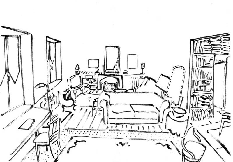
Step 4 – The Stage Decor. A living room in the style of an interior design magazine serves as my template. I draw it.
Step 5 – Character, Decor, and Texts Combined. The thoughts start top-left and develop organically towards the bottom-right in the reading direction, leading to the woman who is thinking them. The handwritten text was too restless.
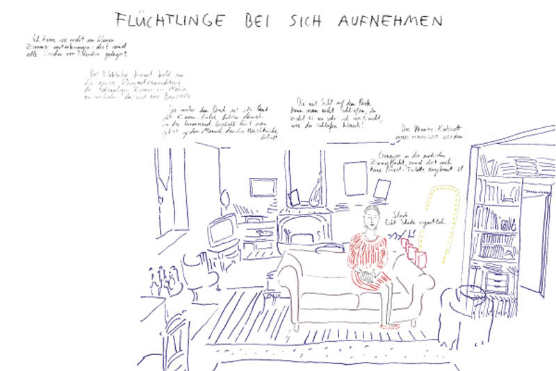
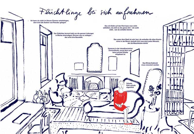
Step 6 – Making the Text Readable for Print. I decide to use a computer font that allows the text to recede into the background, while the living room takes up more space.
Step 7 – Drawing Technique. Decision made: it will be an ink and brush drawing. Back to the style of the original decor sketch.
Step 8 – The Character. It needs to stand out. The simple contrast between two primary colours immediately draws the eye to the main figure.
Step 9 – The Title. So that the title of the illustration fits well into the drawing, it is written by hand – with a coloured pencil.
Review – In retrospect, I would have preferred to choose a man as the main character, as statistically, the majority of women worldwide perform “care work”. But humour stops for no one…